We're all huge fans of Daniel's work. Through Colours Scotland (@colours_scotland), he documents the tones that surface in everyday moments; a welly boot on deck, a frost-bitten dawn, rope coiled on a ferry crossing. Nothing staged, nothing forced. Just an instinct to notice what most of us walk past. What began as a personal visual diary has evolved into a distinct body of work, one that reframes the familiar through hue, texture and timing.

What's your story?
Colours Scotland started out as a visual diary of sorts, a way of linking place and colour. As a designer and artist I’ve always found it useful to collect colours, something I can draw on later as a visual resource. Colour surrounds us, but we don’t always stop to really see it. When you isolate a colour from an image, it suddenly feels quite different and you realise Scotland has a far broader and more interesting palette than you first thought. Over time I realised that other creatives, and people with an affinity for Scotland, felt the same way I did.
Tell us about 5 of your favourite shots

No. 260 - Wheelhouse Boot
A recent post featuring the welly boot of my mate David, who runs a langoustine boat out of Oban. David was completely at ease in his work and his relaxed way of steering felt so natural and practised that it made me laugh.

No. 258 - Old Buoy
I found this old buoy half buried at the far end of Kiloran Beach on Colonsay. The texture and rich colour contrasted beautifully with the soft sand. Choosing colour names needs to feel immediate and not taken too seriously. I try not to overthink it. For this one I paid a small homage to Korean cult cinema. Abstract, yes, but fun.

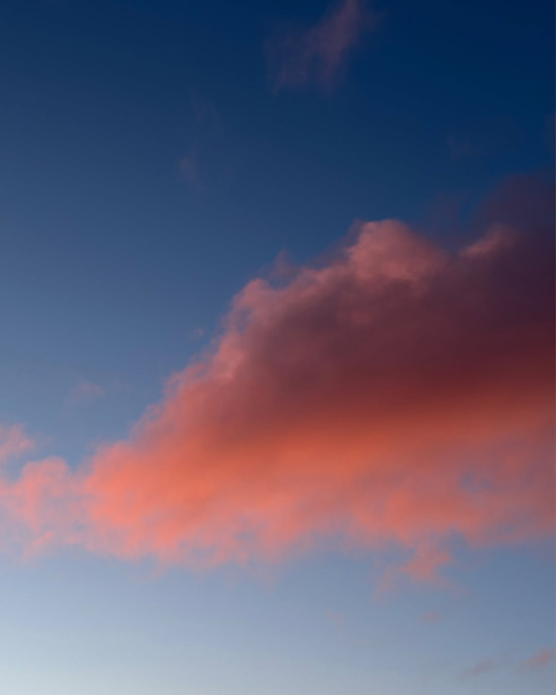
No. 254 - Pom Pom Cloud
Pom Pom Cloud was shot during a dawn dog walk. The ground was still asleep, heavy with frost, but the sky had gone full disco. When it feels right I like to pair colours with audio tracks. Donna Summer’s I Feel Love felt like the right choice.

No. 244 - Hawser
I shot this neatly stacked old rope while crossing on the CalMac ferry between Iona and Fionnphort on Mull. I’m interested in details that are often overlooked but to me feel just as important as the more recognisable Scottish subjects.
No. 155 - Dawn Camp
For me, Colours Scotland is as much a diary of my own life and travels. Dawn Camp captures that moment when you’ve just woken, watching the sun rise through the tent opening while still wrapped in your sleeping bag. Life-affirming.
When you’re out shooting, are you actively searching for certain tones and combinations, or do the colours tend to reveal themselves in the moment?
I just shoot what I see - nothing is staged, set up or filtered - just my life as it happens. That said, I'm always tuned in to my surroundings and on the lookout.
Scotland is often portrayed in quite muted, moody tones but your work feels different. What do you hope people see or feel about Scotland through your images?
There’s so much beautiful photography of Scotland out there, haunting landscapes, misty glens and foreboding seas. It’s stunning, and God knows Scotland can be 'muted', the weather sees to that. But there’s far more to Scotland than dark greys and dull greens. That’s only one part of its palette.
I think Colours Scotland shows a more authentic and sometimes surprising side of the country, and that’s why people connect with it, both here at home and further afield.
Big thanks to Daniel for sharing his perspective and the moments behind the colours. You can explore more of his work via @Colours_Scotland, or website.
Credits: @Colours_Scotland
@danielfreytag
@freytaganderson